Brand guidelines
Every lead. Every member.
Every opportunity.
The communications platform for golf clubs. This is the single source of truth for anyone designing, building, or writing for the CAPTURE brand.
Our story
Golf clubs are losing revenue every single day and most of them don't even know it. Membership enquiries sit unanswered in personal inboxes over the weekend. Society organisers get a quote from three clubs and book whichever one replies first. A member's renewal date passes without a single reminder being sent. A visitor plays a round, enjoys it, and is never contacted again.
This isn't a technology problem. It's a communications problem. Golf clubs have tee sheets, they have websites, they have club management systems. What they don't have is a way to communicate properly with the people who give them money: their members, their visitors, their prospects, and their society organisers.
CAPTURE exists to fix that. We built one platform that handles every communication a golf club needs to send, track, and automate. From the first enquiry to the tenth renewal. From the society quote to the post-event thank you. From the birthday message to the lapsed member re-engagement campaign.
We're not a tee sheet. We're not a club management system. We're the communications layer that sits alongside those tools and handles the part they were never designed to do. Making sure every person connected to your club hears from you at the right time, with the right message, through the right channel.
CAPTURE is a product of Albatross, a digital agency that has worked with golf clubs for years. We built CAPTURE because we kept seeing the same problem: clubs investing in websites, social media, and marketing but having no system to catch what all that investment generates. The leads come in. Nobody follows up. The revenue walks out the door.
We decided to stop watching that happen.
Purpose
We believe every golf club deserves total visibility and control over its commercial operations. We exist to replace the chaos of scattered inboxes, forgotten follow-ups, and disconnected communications with one platform that ensures nothing gets missed.
Mission
To give every golf club in the UK a single platform for every communication they send to members, visitors, prospects, and society organisers, so no enquiry goes unanswered, no member feels forgotten, and no revenue is left on the table.
Vision
To become the communications standard for the UK golf industry. The platform every club uses. The brand every general manager trusts. The voice of how modern golf clubs operate.
Our values
Nothing gets missed
This is our founding principle. Every feature we build, every workflow we design, every automation we create is tested against one question: does this help the club catch something they'd otherwise lose? If it doesn't, we don't ship it.
Built for golf, not adapted for golf
We don't take generic software and rebrand it. Every pipeline, every template, every automation is designed around how golf clubs actually work: society enquiry flows, membership categories, seasonal patterns, committee structures, GDPR requirements. If it doesn't make sense in a golf club, it doesn't belong in CAPTURE.
We set it up. You switch it on.
Golf clubs are busy. General managers don't have time to learn new software. We handle the entire setup (data migration, form configuration, workflow building, template design) so the club's team logs in on day one and everything works. If a club has to spend a week configuring software, we've failed.
Honest, always
We don't overpromise. We don't invent statistics. We don't claim results we can't prove. If CAPTURE isn't right for a club, we tell them. If a feature isn't ready, we say so. Our reputation matters more than any individual sale.
Retention before acquisition
Most software companies obsess over winning new customers. We obsess over keeping the ones we have. If our existing clubs aren't getting value, nothing else matters. This principle also shapes our product: we believe member retention is often more valuable to a club than member acquisition, and our platform reflects that.
Who we serve
Golf clubs are not one market. They are four distinct types of business, each with different revenue models, different priorities, and different communications needs. Every piece of content, every sales conversation, and every product decision must account for which type of club we're speaking to.
The discovery question that identifies the type: "What does your revenue mix look like: primarily membership-driven, or does a lot come from visitors and societies?"
Private members' clubs
Hadley Wood, Sunningdale, Woking
Revenue comes from annual subscriptions. Societies and visitors are secondary, sometimes actively discouraged. The general manager's world revolves around member satisfaction, retention, committee politics, and communication quality.
What matters to them
Member newsletters that look professional. Birthday and anniversary automations. New member welcome sequences. Renewal reminder workflows. Event promotion to existing members. AGM and committee communications. Segmented messaging by member category. Eventually, churn prediction.
Lead with
Member communications, automations, retention.
Never lead with
Pipelines, lead capture, sales tools.
Commercial members' clubs
Windlesham, Stonebridge, Moor Park
Has a membership base but actively sells. Societies, events, corporate days, and membership recruitment are all commercial priorities. These clubs have the dual problem: they need to communicate with members properly AND capture and convert external leads efficiently. This is our sweet spot. The full platform is relevant.
What matters to them
Pipelines for membership and society enquiries. Automated follow-ups for new leads. Member communications and newsletters. Society payment processing. Visitor remarketing. Event promotion. Dashboards showing what's working.
Lead with
Full platform. Enquiry capture plus member comms. Show breadth.
Pay-and-play and proprietary venues
The Hertsmere, driving ranges, proprietary courses
No traditional membership base, or a very light one. Revenue comes from green fees, the range, food and beverage, visitor traffic, and societies. This is a pure commercial operation, closer to hospitality than a traditional golf club.
What matters to them
Building a visitor database from scratch. Remarketing campaigns to past visitors. Society enquiry management. Range visitor communications. Restaurant and event promotion. Post-visit follow-up automations. Google review requests.
Lead with
Visitor communications, database building, repeat visit automation.
Critical gap
These venues have people walking through the door every day who never fill in a form. Physical-to-digital capture mechanisms (QR check-in, Wi-Fi capture, post-round feedback forms) are what make the platform genuinely valuable here.
Resorts and multi-site groups
Foxhills, Al Zorah, Hoburne Golf
Golf is one revenue stream within a larger hospitality operation. The resort has hotel guests, spa visitors, conference delegates, and golf members. The golf operation needs to market to resort guests, manage its own membership, and coordinate with broader resort marketing. Multi-site groups need consistency across locations.
What matters to them
Professional brand-standard communications. Corporate and event pipelines. Cross-selling automation between golf, spa, hotel, and F&B. Membership communications. Cross-site dashboards and reporting. Standardised workflows across locations.
Lead with
Brand-standard comms, corporate event pipelines, multi-site dashboards.
Positioning
Positioning statement
For internal use. Not customer-facing copy.
For general managers and commercial directors at UK golf clubs who are losing revenue to missed enquiries, manual follow-ups, and disconnected communications, CAPTURE is the all-in-one communications platform that captures every lead, automates every follow-up, and keeps every member engaged. Unlike generic CRMs, email marketing tools, or legacy golf systems, CAPTURE is purpose-built for how golf clubs actually operate, from society bookings to member retention to visitor marketing.
The one-line answer
When someone asks "What is CAPTURE?", the answer is:
The communications platform for golf clubs.
That's it. Not a CRM. Not an engagement platform. Not a growth tool.
What CAPTURE is not
CAPTURE is not a tee sheet. It is not a club management system. It does not handle tee time bookings, handicap tracking, competition draws, or course maintenance scheduling. It works alongside existing club systems by handling the commercial and communications side of the operation that those systems were never designed to cover.
When a prospect asks "Does it replace our tee sheet?"
"No. It handles everything your tee sheet doesn't: the enquiries, the follow-ups, the member emails, the society quotes, the visitor marketing. Your tee sheet manages the course. CAPTURE manages the conversation."
Where CRM fits
CAPTURE includes a full CRM with contact management, pipelines, and deal tracking. But CRM is not the headline. It is infrastructure that powers the platform, the same way a database powers Shopify without Shopify calling itself a database company.
When prospects ask whether it has a CRM, the answer is: "Yes, it's built in." Never lead with it.
The HubSpot reference
The phrase "HubSpot for Golf Clubs" is retired from all written materials, website copy, and collateral. It may be used verbally in sales conversations as a shorthand with tech-savvy buyers. Never lead with it. Never put it in writing.
Competitive alternatives
When CAPTURE doesn't exist, clubs use some combination of:
- Personal email inboxes (Gmail, Outlook) for handling enquiries
- Spreadsheets (Excel, Google Sheets) for tracking membership leads and society bookings
- Mailchimp or no tool at all for member newsletters
- Their tee sheet's limited built-in messaging
- WhatsApp groups for internal coordination
- Paper diaries and Post-it notes for follow-up reminders
- Their club management system's basic email function, if it has one
CAPTURE replaces all of this with one platform. The competitor is not another software company. The competitor is the messy, manual, disconnected status quo.
What makes us different
Golf-specific
Every pipeline, template, automation, and workflow is designed for golf clubs. Not adapted from generic software. Built from the ground up for societies, memberships, events, visitors, and the way golf club departments actually operate.
Done-for-you setup
We handle everything. Data migration, form configuration, workflow building, template design, team training. The club's team logs in on day one and it's ready. Live in 7 days, not weeks.
GDPR-compliant from the start
Every form includes consent tracking. Contact preferences and data requests are built in. Data stays in the UK/EU. This matters because many clubs are technically in breach of GDPR without realising it.
24-hour support from people who understand golf
Not a chatbot. Not a generic helpdesk. People who know what a society organiser is, what a membership category means, and why Thursday morning is competition day.
Two entry points, not one
Clubs that just need better member and visitor communications start with CAPTURE Comms at £69/month. Clubs that need the full platform with pipelines, forms, and sales tools start with CAPTURE Growth at £149 to £249/month. Every club has a way in.
Messaging
The CAPTURE framework
The word CAPTURE is both our brand name and a seven-step methodology. Every piece of content, every demo, every sales conversation should reference this framework. It should become synonymous with CAPTURE the way "Inbound" is synonymous with HubSpot.
Capture every enquiry from every source. Web forms, emails, phone calls, social media, walk-ins. Everything lands in one place. Nothing gets lost.
Automate follow-ups so no lead ever waits. Instant replies, task creation, staff notifications, all triggered the moment an enquiry arrives.
Personalise communications to members, visitors, and prospects. Segmented campaigns, tailored messaging, the right message to the right person at the right time.
Track every interaction, every deal, every result. A complete audit trail of who said what, when, and what happened next.
Understand what's working with real-time dashboards. Which channels bring leads, which staff convert them, where deals stall, which campaigns get opened.
Retain members with smart, timely communications. Birthday messages, renewal reminders, re-engagement campaigns, event promotions. Keep members connected to the club.
Execute campaigns, workflows, and growth strategies from one place. Your team gets clarity. You get results. Revenue grows.
Primary tagline
CAPTURE EVERY [Lead / Member / Visitor / Opportunity / Booking / Follow-up]
On the website, the bracketed word rotates with animation. The rotation order matters. It cycles through Lead, Member, Visitor, Opportunity, Booking, Follow-up, ending on Opportunity so that's the word that lingers.
In static contexts (print, email signatures, LinkedIn banners, one-pagers) use: Every lead. Every member. Every opportunity.
Supporting line
One platform. Built for golf clubs.
Sits directly below the tagline in the website hero and on all primary collateral.
Category descriptor
The communications platform for golf clubs.
Used in secondary positions: below the fold on the website, in the one-pager subtitle, in PR, in directory listings, in email footer descriptions. This is the answer to "what is CAPTURE?"
Messaging hierarchy
Every piece of communication follows this priority order. Lead with the top. Go deeper only when space and context allow.
The communications platform for golf clubs.
Golf clubs lose revenue because enquiries fall through the cracks and member communications are inconsistent, manual, and scattered across personal inboxes and spreadsheets.
Every lead captured. Every follow-up automated. Every member engaged. Total visibility over what's happening in your business.
Trusted by clubs including Stonebridge Golf Club, Hoburne Golf, and The Hertsmere.
The CAPTURE system: Capture, Automate, Personalise, Track, Understand, Retain, Execute.
Email campaigns, automated workflows, visual pipelines, real-time dashboards, SMS, booking forms, society tools, AI features.
Features are Level 6, not Level 1. The old positioning led with features. The new positioning leads with category and problem, supported by outcomes and proof, with features as the detail layer underneath.
The brand story (StoryBrand structure)
The Hero
The general manager or commercial director at a UK golf club. They're responsible for revenue, member satisfaction, and operational performance. They answer to a committee or ownership group. They're busy, stretched thin, and under pressure to grow the business.
External problem
Enquiries are scattered across personal inboxes. Follow-ups get forgotten. Spreadsheets are the tracking system. There's no visibility on what the team is doing. Member communications are inconsistent or non-existent.
Internal problem
They feel out of control. They know things are falling through the cracks but can't prove it. They worry about the enquiry that came in on Friday afternoon that nobody followed up. They're frustrated that they can't show the committee what's actually happening in the business. They feel like they're running blind.
Philosophical problem
It shouldn't be this hard. Running a golf club's commercial operation shouldn't mean living in spreadsheets and hoping someone remembered to reply to that society enquiry. There should be a better way.
The Guide (CAPTURE)
We understand the problem because we work with golf clubs every day. We've seen what happens when enquiries fall through the cracks, and we've built the system that stops it. (Empathy plus authority.)
The Plan
Step 1: We set everything up for you: data migration, forms, workflows, templates. Step 2: Your team logs in and starts using the platform from day one. Step 3: You see every enquiry, every follow-up, and every result in one place.
Failure
Without a system, the club continues losing revenue to slow responses, missed follow-ups, and inconsistent communications. Competitors who reply faster win the booking. Members who feel forgotten don't renew. The committee never gets proper reporting. The GM stays trapped in operational chaos.
Success
With CAPTURE, the GM has total visibility. Every enquiry is captured. Every follow-up is automated. Every member hears from the club at the right time. The committee gets real reports. The team has clarity. Revenue grows, not because of one big change, but because nothing gets missed any more.
Elevator pitches
25 words
CAPTURE is the communications platform for golf clubs. One place for every enquiry, every follow-up, and every member communication. Nothing gets missed.
50 words
Golf clubs lose revenue because enquiries fall through the cracks and member communications are scattered across personal inboxes and spreadsheets. CAPTURE is the all-in-one communications platform built exclusively for golf clubs. We capture every lead, automate every follow-up, and keep every member engaged, all from one platform.
100 words
Every golf club has the same problem. A society organiser fills in an enquiry form on Friday afternoon and nobody follows up until Tuesday. A membership lead emails the club and it sits in someone's personal inbox for a week. A member's renewal date passes without a single reminder. CAPTURE solves all of this. We're the communications platform built exclusively for golf clubs. One place for every enquiry, every follow-up, every newsletter, every automation, and every campaign your club needs to send. We handle the setup. Your team logs in and it works. Trusted by clubs including Stonebridge, Hoburne Golf, and The Hertsmere.
Boilerplate
For press, directories, partner pages
CAPTURE is the communications platform for golf clubs. Built exclusively for the UK golf industry, CAPTURE gives general managers and commercial directors one platform for every enquiry, every follow-up, and every member communication, replacing scattered inboxes, spreadsheets, and disconnected tools with complete visibility and control. CAPTURE is a product of Albatross. Learn more at capturecrm.app.
Voice & tone
Brand archetype
CAPTURE is the Sage-Creator. The Sage brings knowledge, expertise, and deep understanding of the golf industry. The Creator brings the tools and systems that empower clubs to build something better. We are the knowledgeable partner who gives clubs the means to take control.
We are not the Hero. The golf club is the hero. We are the guide, the experienced adviser who hands them the tools and shows them the way.
Brand personality
Primary
Competence
Reliable, intelligent, capable, proven. When a GM chooses CAPTURE, they need to trust that it works, that the data is accurate, that the system won't let them down, and that the people behind it know what they're doing.
Secondary
Sincerity
Genuine, honest, down-to-earth, wholesome. We don't overpromise. We don't use jargon. We talk like a human being who understands the golf industry, not like a software company trying to sound impressive.
Touch of
Sophistication
Golf has heritage, tradition, and aspirational qualities. CAPTURE should feel polished and professional. Never cheap, never scrappy, never startup-messy.
Voice attributes
Five principles that govern how CAPTURE sounds across every touchpoint. Each one has a boundary to prevent drift.
Knowledgeable, but not patronising
We know golf clubs inside out. We understand society day logistics, the politics of membership categories, why Thursday mornings matter, and what keeps GMs awake at night. But we never talk down to anyone. We share expertise generously without making people feel ignorant for not knowing it already.
Reference specific golf club scenarios: society enquiry flows, membership renewal cycles, mid-week versus weekend patterns. Use the language clubs actually use.
Explain basic golf concepts as if the reader doesn't know them. Use generic business examples when golf-specific ones exist.
Direct, but not blunt
We say what we mean. We don't hide behind corporate language or marketing waffle. If something's a problem, we call it a problem. If CAPTURE can't do something, we say so. But we're never rude, dismissive, or cold. There's warmth in our directness.
Get to the point. Lead with the answer, then explain. Use short sentences when making important points. Say "This does X" not "Our innovative solution enables the facilitation of X."
Pad sentences with qualifiers. Use passive voice to avoid stating things clearly. Start paragraphs with throat-clearing phrases like "It's worth noting that..." or "It goes without saying..."
Confident, but not arrogant
We believe in what we've built. We stand behind our product and our team. We make clear claims. But we never position ourselves as the only answer, never dismiss competitors with contempt, and never claim results we haven't earned. Confidence earns trust. Arrogance destroys it.
Make clear claims backed by proof. Say "Trusted by Stonebridge, Hoburne Golf, and The Hertsmere" not "Some clubs have found value in our platform." State what CAPTURE does without hedging.
Use superlatives without evidence ("the best", "the most powerful", "the only"). Attack competitors by name. Claim results that haven't been validated.
Modern, but not dismissive of tradition
Golf is a sport with deep traditions and a community that values heritage. We're bringing modern tools to the industry, not disrupting it. We respect how clubs have operated for decades while showing them there's a better way to handle the commercial side. We're an evolution, not a revolution.
Write in contemporary, clean British English. Reference current challenges (GDPR, digital transformation, post-COVID revenue pressure). Use the visual language of modern SaaS without the jargon.
Use buzzwords: "cutting-edge," "revolutionary," "game-changing," "next-gen," "AI-powered" (unless describing a genuinely AI-driven feature specifically). Mock or dismiss traditional methods.
Warm, but not saccharine
We care about our customers. We care about their results. We write with warmth and empathy. But we never sound sycophantic, overly enthusiastic, or artificially cheerful. No exclamation marks in every sentence. No "We're so excited to announce..." energy. Just genuine warmth from people who give a damn.
Acknowledge the reader's challenges with empathy. Use "you" and "your club." Write as if you're speaking to a person, not a persona. When delivering difficult news, lead with understanding.
Overuse exclamation marks. Start emails with "Hope you're well!" Write in the forced-enthusiasm tone of generic SaaS marketing. Use emojis in professional communications.
Tone spectrum
The voice stays constant. The tone shifts depending on context.
Sales outreach
Warm, consultative, curious
Ask questions before making claims. Lead with the problem, not the product. Sound like a knowledgeable peer, not a salesperson.
Website copy
Confident, clear, outcome-focused
Short sentences. Strong verbs. Every section should answer "what's in it for my club?" within the first line.
Email campaigns
Professional, polished, on-brand
Remember that CAPTURE powers the email but the club's members see the club's brand. The quality reflects on both the club and on us.
Support
Patient, clear, encouraging
Never make the user feel stupid for asking a question. Provide steps, not paragraphs. Assume the reader is busy and mildly frustrated.
Error messages
Calm, specific, action-oriented
Say what happened, why, and what to do next. Never say "Oops!" or "Something went wrong."
Social media
Personal, insightful, conversational
Posts come from James's profile, not the brand page. Share observations about the golf industry, not product announcements.
Internal comms
Informal but clear
Directness is welcome. Humour is welcome. But professionalism still applies. Anything written internally could surface externally.
Words we use
Words we never use
Synergy. Never, for any reason.
Best-in-class. Meaningless.
Cutting-edge. Dated.
Revolutionary / Game-changing. Overpromising.
Leverage (as a verb). Corporate jargon.
CRM (as a lead descriptor). Say "communications platform."
Customer. Clubs don't call their members customers.
Smart platform / Intelligent platform. Vague.
30% increase in bookings. Or any unvalidated metric.
Writing conventions
British English, always. Colour not color. Organise not organize. Centre not center. Enquiry not inquiry.
No emojis. In professional communications: emails, website copy, proposals, one-pagers.
Oxford comma. "Members, visitors, and society organisers" not "Members, visitors and society organisers."
Numbers. Spell out one to nine, use numerals for 10 and above. Exception: always use numerals for prices, time periods, and statistics.
Sentence case for headings. "Book a 15-minute demo" not "Book A 15-Minute Demo."
Active voice. "CAPTURE sends an automated reply" not "An automated reply is sent by CAPTURE."
Short paragraphs. Three to four sentences maximum in web copy. Five to six maximum in documents.
Logo
Primary logo
The hub-and-node "C" mark plus the "CAPTURE" wordmark, displayed horizontally. The mark represents connection — every lead, every member, every opportunity linked to a single hub.
Colour variants
Five approved colour versions. Use green on white as the default. Use white or yellow on dark backgrounds. Pink is for campaign and social use only.
Primary (Green)
Black
White
Pink
Yellow
Clear space
Maintain padding equal to the height of the "C" icon on all sides.
Minimum size
Full logo
Digital: 120px wide
Print: 30mm
Icon only
Digital: 24px
Print: 8mm
Usage contexts
Header / Nav
Favicon
Dark background
Footer
Downloads
Always use these official files. Never recreate the logo from scratch or alter the exported files.
Logo don'ts
Don't stretch or distort
Don't change colours
Don't add effects
Don't place on busy backgrounds
Colour system
Colour sets the mood.
CAPTURE uses colour expressively. Illustrations are rich, full-colour compositions — terracottas, teals, dusty blues, ochres, warm greys — whatever the scene needs to feel alive. Cohesion comes from consistent style (gouache texture, flat shapes, warm lighting) rather than rigid palette restriction. CAPTURE Green runs through the brand as a thread, but it does not dominate every scene.
The core brand palette
The foundation. Every colour in the system traces back to these. Click any swatch to copy its hex code.
Three storytelling moods
Each mood has a colour starting point, but illustrations are free to use a rich, expressive range. These are guides, not restrictions.
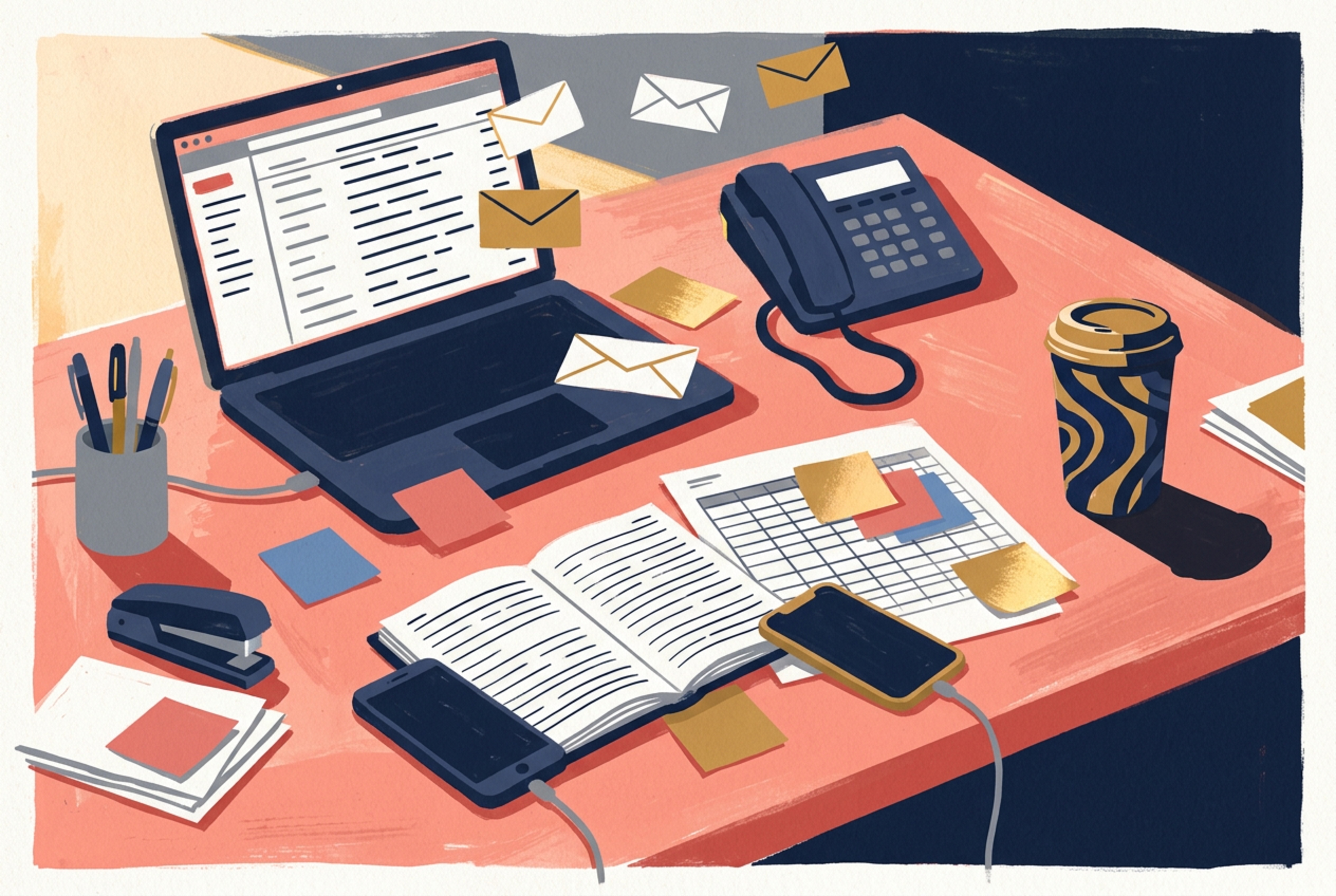
1. Chaos
The problem. The before state. The world without CAPTURE. Use this mood for anything representing the current pain: cluttered desks, lost enquiries, operational mess, overwhelm, scattered spreadsheets, missed follow-ups.
Start here, then add whatever the scene needs. Warm salmons, dusty pinks, muted blues, ochres — let the scene feel cluttered and human. The mood is overwhelm, not the palette.
Mood
Overwhelm. Too many things demanding attention. Warm, human, familiar. A golf club GM should look at this and think 'that is my desk.'
Where it appears
Website 'before' sections, Chaos vs Control comparisons, LinkedIn problem-awareness content, pitch deck opening slides, the Chaos illustration.
2. Solution
The answer. The after state. The world with CAPTURE. Use this mood for anything representing the product, the dashboard, the command centre, calm control. The desk is clean. The screen shows green. The morning light is warm.
CAPTURE Green anchors the scene but doesn't need to dominate. Layer in teals, warm greys, creams, soft blues — whatever creates that calm, in-control feeling.
Mood
Quiet confidence. Calm morning. Everything under control. Intentional, focused, unhurried. A GM who knows exactly what is happening without asking anyone.
Where it appears
Website 'after' sections, product screenshots, demo walkthroughs, the Command Centre illustration, feature pages, CTA sections.
3. Golf World
The aspirational context. The environment CAPTURE serves. Use this mood for anything showing the golf club world: clubhouse terraces, course views, society arrivals, member moments. No technology visible.
The richest palette of the three. Fairway greens, terracotta paths, warm stone, blue sky, ochre light — bring the course to life with full colour.
Mood
Aspirational, welcoming, professional. British countryside warmth. A well-run golf club on a good morning. The terrace where members want to be.
Where it appears
Website hero backgrounds, brand guidelines, aspirational sections, the Clubhouse Terrace illustration, presentation backgrounds, social media headers.
UI accent colours
Feature icon backgrounds only. Do not use elsewhere.
Note: The icon system is moving toward unified CAPTURE Green (#368E6F) circles with white shapes for all icons. These multi-colour accents are legacy and may be phased out. See the Icons section for the current direction.
Colour in illustrations
Rich, expressive, cohesive through style.
CAPTURE illustrations use a full, rich colour range. Unlike brands that restrict illustrations to a handful of brand colours, we let each scene breathe with the colours it naturally needs — terracottas, teals, dusty blues, ochres, warm greys, deep greens. Cohesion comes from the consistent gouache style, not from colour restriction.
Colour defines form
There are no outlines. Where one shape ends and another begins is determined entirely by colour contrast. Dark navy laptop on a warm desk. Green pipeline columns on a white screen. Cream bunker on a green fairway. If two adjacent areas share the same colour, they merge visually. Contrast is structure.
Light is colour
Morning light is warm gold applied as a separate flat shape on the surfaces it hits. Shadows are darker, cooler flat shapes. No gradients. No opacity changes. The direction of light is expressed purely through which faces of an object get the warm treatment and which get the cooler shadow.
Style is the unifier
What makes a CAPTURE illustration recognisable is not a restricted palette — it is the gouache texture, the flat colour fills, the bold geometric shapes, the warm directional lighting, and the confident composition. Two illustrations can use completely different colour ranges and still feel unmistakably CAPTURE.
Quality check: Does the illustration feel like CAPTURE? Look for gouache texture, warm lighting, bold shapes, and confident composition. CAPTURE Green should appear as a thread — in vegetation, UI elements, or accent details — but does not need to dominate.
Do / Don't
Do
Use CAPTURE Green for CTAs, active states, and anything representing the product or solution.
Use Warm Gold sparingly as an accent, never as a background colour for large areas on the website.
Use Dark Navy (#1A1A1A) for headlines. It is warmer and more refined than pure black.
Use Soft Grey (#F5F5F5) to alternate section backgrounds on long pages.
Let illustrations use a rich, full colour range. Cohesion comes from style, not restriction.
Use CAPTURE Green as a thread through illustrations — in vegetation, UI elements, or accent details.
Don't
Use CAPTURE Green for headlines or large text blocks. It lacks sufficient contrast for comfortable reading at body size.
Use pure black (#000000) for text. Always use Dark Navy or Body Grey.
Use UI accent colours for anything other than feature icon backgrounds.
Restrict illustrations to only brand colours. Let scenes use the full range they need.
Use neon or overly saturated colours in illustrations. Keep the palette natural and warm.
Forget the gouache style. Colour freedom works because the style stays consistent.
Colour and the website
How the palettes map to page sections.
The CAPTURE website follows a predictable colour rhythm. The hero section uses white or soft grey with green CTAs. The Chaos vs Control comparison uses blush/pink tinting on the left and white with green accents on the right. Mid-page CTA banners use CAPTURE Green backgrounds with white text. Feature grids use white card backgrounds on soft grey sections. The final CTA section uses CAPTURE Green.
Hero
Neutral
Chaos vs Control
Contrast
CTA Banner
Action
Features
Neutral
Testimonials
Neutral
Final CTA
Action
The eye is trained to associate green with "do something" and white/grey with "learn something."
Quick reference
Primary brand colour
#368E6F
Accent / warmth
#FFE6A1
Headlines
#1A1A1A
Body text
#333333
Secondary text
#666666
Section backgrounds
#F5F5F5
Borders and dividers
#E5E5E5
Cards and page backgrounds
#FFFFFF
Warm illustration surfaces
#FFF8F0
Warm illustration surfaces
#E8A090
Urgency / alerts
#F87171
Cool illustration accents
#6B8CAE
Neutral illustration tone
#E8E4DE
Typography
CAPTURE uses a two-font system: Fraunces for headings and General Sans for body text, buttons, and UI. This pairing balances personality and sophistication (Fraunces) with clean modern readability (General Sans). Body text must never go below 16px on any device.
Fraunces
Headings & display
Google Fonts · Variable optical size
Regular 400
Medium 500
Semi-bold 600
"Every lead. Every member. Every opportunity."
General Sans
Body, UI & buttons
Fontshare
Regular 400
Medium 500
Semi-bold 600
CAPTURE is the communications platform for golf clubs. One place for every enquiry, every follow-up, and every member communication.
Why this pairing
Fraunces is an old-style serif with a distinctive personality — it conveys the heritage and warmth of golf while feeling modern and confident. General Sans provides clean, neutral readability for body text and interface elements.
Together they create a system that feels premium and established without being corporate or cold.
Type scale
Every lead. Every member.
H1 (Hero headlines)
Fraunces · Semi-bold (600) · 56–64px
font-family: 'Fraunces', Georgia, serif;
font-size: clamp(3.5rem, 5vw, 4rem);
font-weight: 600;
line-height: 1.1;
color: #1A1A1A;
How we sound
H2 (Section headers)
Fraunces · Semi-bold (600) · 40–48px
font-family: 'Fraunces', Georgia, serif;
font-size: clamp(2.5rem, 4vw, 3rem);
font-weight: 600;
line-height: 1.15;
color: #1A1A1A;
Voice attributes
H3 (Subsections)
Fraunces · Semi-bold (600) · 24–32px
font-family: 'Fraunces', Georgia, serif;
font-size: clamp(1.5rem, 2.5vw, 2rem);
font-weight: 600;
line-height: 1.3;
color: #1A1A1A;
CAPTURE is the communications platform for golf clubs. One place for every enquiry, every follow-up, and every member communication. Nothing gets missed.
Body
General Sans · Regular (400) · 16–18px
font-family: 'General Sans', system-ui, sans-serif;
font-size: clamp(1rem, 1.1vw, 1.125rem);
font-weight: 400;
line-height: 1.6;
color: #333333;
Version 2.0, February 2026
Small / Captions
General Sans · Regular (400) · 14px
font-family: 'General Sans', system-ui, sans-serif;
font-size: 0.875rem;
font-weight: 400;
line-height: 1.5;
color: #666666;
Book a 15-minute demo
Buttons
General Sans · Semi-bold (600) · 16px
font-family: 'General Sans', system-ui, sans-serif;
font-size: 1rem;
font-weight: 600;
line-height: 1;
color: #FFFFFF;
Hierarchy in practice
Headlines in Fraunces, Semi-bold, Dark Text (#1A1A1A)
Body in General Sans, Regular, Body Grey (#333333)
Secondary text in General Sans, Regular, Muted Grey (#666666)
Links and CTAs in General Sans, Semi-bold, CAPTURE Green (#368E6F)
Components
The building blocks of CAPTURE's digital presence. Every component follows the same principles: clean, confident, purpose-built. Nothing decorative. Nothing that doesn't earn its place.
Buttons
Primary
Main CTA. One per section maximum.
Secondary
Supporting action. Paired with primary.
Ghost / text
Tertiary action. Inline links.
Disabled
Form submitting or unavailable.
Specifications
Border radius
8px
Padding
12px 24px
Font weight
600 (semibold)
Transition
150ms ease
Button copy rules
Always sentence case. Never ALL CAPS.
Always action-oriented, starting with a verb. "Book a demo" not "Learn more."
Be specific. "See it in action" not "Click here."
Primary CTA stays consistent: "Book a 15-minute demo" across the entire site.
Maximum two buttons side by side. Primary always on the left.
Form fields
Specifications
Validation: Error states use Soft Red (#F87171) border. Success uses CAPTURE Green. Error messages appear below the field in Soft Red, 12px.
Cards
Total visibility
See every enquiry, every follow-up, and every result in one place.
Response time
47min
Industry average: 23 hours
"The ability to track, manage and have visibility of every lead we receive has been an absolute game changer for our business."
James Slade
Director of Golf, Hoburne Golf
Card specifications
Background
#FFFFFF
Border radius
12px
Shadow
0 2px 8px rgba(0,0,0,0.08)
Padding
24px
Tabs and navigation
Pill tabs
Underline tabs
Active state: CAPTURE Green background (pills) or CAPTURE Green underline (tabs). Never use colour-coded tabs — the active indicator is always green. Inactive tabs use Body Grey text with hover state.
Badges and tags
Badges use soft tinted backgrounds with saturated text. Border radius is always 9999px (full pill). Font size is 12px, weight 600.
Alerts and banners
Success
Your demo has been booked for Tuesday at 10am.
Information
Your free trial includes full access to all features for 14 days.
Warning
You have 3 enquiries awaiting a response for more than 24 hours.
Error
Something went wrong. Please try again or contact support.
Empty and loading states
No enquiries yet
When new enquiries come in, they will appear here.
Loading your pipeline...
Empty states are opportunities. Never show a blank screen. Every empty state should explain what will appear, why it is empty, and offer a clear next step. Loading skeletons use #E5E5E5 with a pulse animation.
Chaos vs. CAPTURE comparison
This is CAPTURE's signature visual pattern. It appears on the website, in pitch decks, LinkedIn content, and one-pagers. The structure should be consistent wherever a before/after or problem/solution comparison appears.
Without a system
Enquiries scattered across personal inboxes
Follow-ups forgotten over the weekend
No visibility on what the team is doing
Member communications inconsistent
Spreadsheets as the tracking system
Revenue walking out the door
With CAPTURE
Every enquiry captured in one place
Automated follow-ups triggered instantly
Total visibility over every deal and interaction
Professional, consistent member communications
Real-time dashboards and reporting
Nothing gets missed. Revenue grows.
Pattern rules
Chaos side: Blush/pink background (#FCE8E8). Red X icons. Heading: "Without a system."
CAPTURE side: White background with green border. Green check icons. Heading: "With CAPTURE."
Always side by side on desktop, stacked on mobile with chaos on top.
Mirror the language. Each chaos point should have a direct CAPTURE counterpart on the same row.
CTA banners
Stop losing revenue to your inbox
Book a 15-minute call. We will show you exactly how much revenue your club is leaving on the table.
CTA banners use CAPTURE Green background with white text. They appear mid-page and at the page end. The primary button inverts to white background with green text. Secondary button uses a white border on green. These banners are the action moments — the eye is trained to associate green with "do something."
UI iconography
For digital interfaces (website, dashboard, emails), use Lucide React icons. These are separate from the brand icon system — Lucide handles functional UI needs, while the green-circle brand icons handle marketing and collateral. See the Icons section for the brand icon system.
Visibility
Automation
Pipeline
Members
Navigation
Stroke width
1.5px for standard, 2px for emphasis
Default colour
Body Grey (#333333) or Muted Grey (#666666)
Active colour
CAPTURE Green (#368E6F)
Sizes
14px (inline), 16px (buttons), 20px (cards), 24px (features)
Layout & spacing
Consistency in spacing is what separates a designed page from a collection of elements. CAPTURE uses a 4px base unit and predictable patterns to create rhythm, breathing room, and visual hierarchy.
Spacing scale
Based on a 4px unit. Every spacing value in the system is a multiple of 4. Use Tailwind spacing tokens directly.
| Token | Pixels | Visual | Common use |
|---|---|---|---|
| 0.5 | 2px | Hairline gaps | |
| 1 | 4px | Tight inline spacing | |
| 1.5 | 6px | Label-to-field gap | |
| 2 | 8px | Icon-to-text gap | |
| 3 | 12px | Card inner padding (compact) | |
| 4 | 16px | Standard padding, form field padding | |
| 5 | 20px | Section sub-gaps | |
| 6 | 24px | Card padding, mobile page margins | |
| 8 | 32px | Column gaps, content spacing | |
| 10 | 40px | Section heading to content | |
| 12 | 48px | Section sub-section gap | |
| 16 | 64px | Large section gaps | |
| 20 | 80px | Desktop page margins, section padding | |
| 28 | 112px | Desktop section vertical padding |
Page layout
Section (white)
py: 80–112px
Section (grey #F5F5F5)
alternating
Section (white)
CTA Banner (green)
Layout specifications
Responsive breakpoints
Single column stack. Sidebar collapses to hamburger menu. Typography scales down via clamp().
Two-column grids. Sidebar visible. Content starts to breathe.
Full layout. Sidebar fixed. Three-column grids where appropriate.
Content maxes out at 1200px and centres. Extra space becomes margins.
Section rhythm
Long pages use alternating white and Soft Grey (#F5F5F5) section backgrounds. This creates a natural reading rhythm and prevents content from bleeding together. CTA banners break the pattern with CAPTURE Green.
Hero
Features
Content
CTA
Content
Content
Final CTA
Whitespace principles
Whitespace is intentional
Empty space is not wasted space. It creates focus, hierarchy, and breathing room. Never fill space just because it is there.
Group related elements
Elements that belong together should be closer together than elements that don’t. A heading is always closer to its content than to the previous section.
Consistent vertical rhythm
Use the spacing scale. If one section has 48px between heading and content, all sections should. Inconsistency feels amateur.
Let the content breathe
Body text has generous line height (1.6–1.75). Paragraphs have clear spacing. Cards have internal padding. Nothing feels cramped.
Motion & animation
Subtle, purposeful motion only. If an animation doesn't guide the eye, confirm an action, or create delight at a key moment, remove it. Motion should never delay or make the interface feel slow.
Scroll-triggered reveals
revealSections fade up 24px on scroll entry. Duration: 600ms, ease. Staggered children at 80ms intervals.
Hover transitions
transition-colorsSmooth colour and shadow changes on buttons and cards. Duration: 150–200ms, ease.
Loading spinners
animate-spinCAPTURE Green spinner, 16px. Animate-spin class. Appears immediately, no artificial delay.
Toast notifications
toast-in / toast-outSlide up 8px on enter, slide up 8px on exit. Duration: 200ms. Auto-dismiss after 2 seconds.
Motion don'ts
No bouncing or elastic animations — CAPTURE is confident, not playful
No animation on page load beyond the initial reveal
No parallax scrolling effects
No auto-playing carousels or slideshows
Photography & imagery
Photography is the proof layer. While illustrations sell the vision — the calm command centre, the connected clubhouse — photography proves the reality. Real clubs. Real results. Real people. The two work alongside each other but serve different roles and should never be mixed within a single asset.
Illustration
Sells the vision
Concepts, processes, before/after comparisons, the CAPTURE Framework, feature explainers. The aspirational story. What could be.
Photography
Proves the reality
Client testimonials, case studies, team credibility, the actual product interface. The evidence. What is.
Photography categories
Golf course and clubhouse
Shoot in warm, natural light — golden hour or bright morning
Matches the illustration warmth and CAPTURE brand temperature
Wide establishing shots that show the environment
The viewer should feel "I want to be there"
Clubhouse terrace, first tee, course views, pro shop
These are the spaces GMs care about and recognise
No people required — the environment tells the story
Avoids stock photo feel, keeps focus on the venue
British courses preferred where possible
CAPTURE serves UK golf clubs. The landscape should feel familiar.
Product screenshots
Always use real CAPTURE interface, never mockups
Mockups feel dishonest. Show the actual product.
Clean up all test data before capturing
No "Test Club" or "John Doe" in screenshots
Use realistic club names and data
The viewer should believe this is a live system
Highlight the relevant feature area if needed
A subtle green glow or zoom helps guide the eye
Consistent browser or device frames throughout
Use the same MacBook/iPhone frame across all materials
People and team
Real staff in their natural environment
A GM at their desk, not a model in a studio
Candid over posed — working, talking, thinking
CAPTURE is professional but human
Warm, natural lighting preferred
Consistent with brand warmth. No harsh flash.
Smart casual dress appropriate to golf clubs
Polo shirts, smart trousers — the real uniform
Always get permission before publishing
See Governance section for evidence collection rules
Client proof material
Testimonial photos should show the person, not just a logo
Faces build trust faster than brand marks
Logo bar uses clean, consistent sizing
All logos same height, grayscale optional, equal spacing
Case study heroes show the club environment
Connect the result to a real, recognisable place
UGC video is gold — request from happy clients
A 30-second phone video from a GM outperforms any production
Never fabricate metrics or attribute quotes incorrectly
Credibility is everything in a market this small
Screenshot specifications
| Context | Format | Resolution |
|---|---|---|
| Website hero | PNG or WebP | 2x retina (min 2880px wide) |
| Feature sections | PNG or WebP | 2x retina (min 1920px wide) |
| Pitch deck | PNG | 2x (min 1920px wide) |
| LinkedIn posts | PNG | 1080 x 1080px or 1200 x 628px |
| Email headers | PNG | 1200px wide, <200KB file size |
| One-pager | PNG (300dpi for print) | Min 1200px at 300dpi |
Do / Don't
Do
Use real CAPTURE interface screenshots with realistic data
Use professional golf course photography — the course, the clubhouse, the terrace
Show the environment that general managers actually work in
Clean up all test data before capturing any screenshots
Use consistent browser or device frames across all materials
Shoot in warm, natural light that matches the brand warmth
Request permission before using client photos or logos
Don't
Use stock photos of people pointing at computer screens
Use generic "business meeting" imagery — this is not a SaaS landing page
Use placeholder images from template libraries
Use AI-generated images of golf courses — they look synthetic and undermine trust
Use any imagery that feels like it belongs to a different industry
Show screenshots with test data, "Lorem ipsum", or cluttered interfaces
Mix photography and illustration within a single asset
Screenshot checklist
Before publishing any product screenshot, check every item.
Real data
Realistic club names, member names, and pipeline data. No "Test Club" or "Jane Doe."
Clean interface
No dev tools, no error banners, no unread notification badges cluttering the view.
Relevant feature visible
The screenshot shows the exact feature being discussed. Nothing extraneous.
Consistent framing
Same device frame (MacBook, iPhone) used throughout the same document or page.
Retina resolution
Captured at 2x minimum. No blurry or upscaled screenshots.
No sensitive data
No real email addresses, phone numbers, or financial data from actual clients.
Illustration

The Solution
Total visibility — one platform, one dashboard, nothing gets missed.
The Problem
Monday morning chaos — enquiries falling through the cracks.
Style definition
CAPTURE illustrations use a gouache painting texture with visible paper grain, bold geometric shapes, and flat colour fills with no outlines. Forms are defined by one colour meeting another — not by line art. The aesthetic sits between vintage travel poster and modern editorial illustration: warm, confident, and instantly recognisable.
Illustrations use a rich, expressive colour range — not just brand colours. Terracottas, teals, dusty blues, ochres, warm greys — whatever the scene needs. Cohesion comes from the consistent gouache style, warm directional lighting, and bold composition, not from colour restriction. CAPTURE Green runs through as a thread, not a cage.
"Every illustration should feel like looking through a window into a well-run golf club."
Core principles
Confident, not decorative
Every element serves a purpose. No floating shapes, no abstract fills, no decorative flourishes.
Specific, not generic
Never "person at laptop." Always a recognisable golf club scene with specific detail.
Warm, not cold
Golf clubs are warm places. Carry that warmth through colour temperature and lighting.
Controlled, not busy
Rich colour does not mean cluttered. Readable in under two seconds. White space is a tool.
Colour approach
Illustrations are free to use a rich, varied colour range. The Colour section has mood starting points — but they are guides, not restrictions.
Use the full range
Terracottas, teals, dusty blues, ochres, warm greys, deep greens — whatever the scene needs. Colour should serve the mood, not a rulebook.
CAPTURE Green as thread
CAPTURE Green (#368E6F) should appear somewhere — in vegetation, a UI element, an accent detail — but it does not need to dominate. It is a thread, not a cage.
Style is the unifier
Two illustrations can use completely different colour ranges and still feel unmistakably CAPTURE — because the gouache texture, warm lighting, and bold shapes tie them together.
Colour defines form. There are no outlines. Morning light is warm gold applied as a flat shape, not a filter. Shadows are darker, cooler flat shapes. Texture (grain, tonal variation) lives inside each colour fill.
Lighting & depth
Directional warm lighting creates depth and mood. The effect should feel like late-morning sunlight in a clubhouse.
Warm light from upper left or from a window/doorway within the scene
Shadows are darker tones of the base colour, not black overlays
Highlights are lighter tones or Gold/Yellow accent
The effect should feel like late-morning sunlight in a clubhouse
Shape language
Simplified but proportionate. Faces suggested, not detailed — jawline, hair, posture. Clothing in block colour. Hands can hold phones or gesture.
Clubhouses, offices, pro shops rendered with clean geometric planes and strong perspective diagonals. Buildings feel solid and established.
Screens and dashboards as clean rectangles with simplified UI in accent colours. Readable as "this is CAPTURE" without actual text.
Fairways, greens, trees, sky as bold colour planes. Smooth curves for terrain, geometric trees, wide sky. Signals "golf" without showing a golf ball.
Phones, laptops, coffee cups, golf bags as clean geometric shapes with directional lighting applied.
Composition rules
Strong perspective
Confident viewpoints, diagonal lines, avoid flat straight-on compositions.
Clear focal point
One element your eye goes to first, usually in CAPTURE Green or receiving warm light.
Three layers
Foreground, midground, background to create depth.
The CAPTURE frame
Use architectural framing (doorways, windows, screen edges) to contain scenes, echoing the "C" target mark concept.
Subject matter library
Cluttered desk with Post-it notes, ringing phone, multiple email tabs, spreadsheet — Monday morning chaos
Personal inbox with 47 unread emails, some flagged, some forgotten — enquiries falling through cracks
Whiteboard covered in scribbled names and dates — the society booking "system"
Empty office on Friday afternoon, notification light blinking on unattended computer — the weekend enquiry nobody sees
When to use illustration vs. photography
Use illustration for
Concepts and processes
CAPTURE Framework
Before/after comparisons
LinkedIn content
Email headers
Website hero sections
Pitch deck storytelling
Feature explainers
Onboarding materials
Use photography for
Client testimonials
Case study heroes
Team credibility
Logo wall context
"Real clubs, real results" proof layer
Illustrations and photography serve different purposes and should not be mixed within a single asset. Use them alongside each other but keep them separate. Illustration sells the vision. Photography proves the reality.
AI generation — prompt template
Every CAPTURE illustration uses the same style DNA. Copy the master style block, add your scene brief, and include the standard negative prompt. The style stays consistent automatically — you only change what is in the scene.
Master style block
Always the same. Copy once.
Scene brief
Your scene. Viewpoint, subject, mood.
Negative prompt
Always the same. What to avoid.
1. Master style block — copy this into every prompt
Flat illustration with gouache painting texture throughout, visible paper grain, slightly imperfect edges where colour shapes meet. Screen print aesthetic with subtle colour overlap at boundaries. Not vector art. Not clean digital. Every surface has texture and tonal variation within the same colour fill.

All forms defined by flat colour shapes meeting each other. No black outlines. No line art. No strokes around objects. Depth and separation created purely through colour contrast between adjacent shapes. Shadows are separate flat colour shapes, not gradients or opacity.

Strong directional lighting from upper left. Warm gold light catches the top-left faces of all objects. Shadows fall to the lower right. Highlights are lighter tones or warm gold accents.

Rich, expressive colour palette. Include deep green (#368E6F) as a recurring thread — in vegetation, UI elements, or accent details. Use warm, natural tones — terracottas, ochres, warm greys, teals, dusty blues — whatever the scene needs. No neon. Keep colours warm and grounded.

No text anywhere. No words, no labels, no letters on any surface.
2. Scene brief — customise for each illustration
Replace the bracketed sections with your scene details. Append this after the master style block.
[VIEWPOINT]: e.g. Bird's-eye isometric / Three-quarter from behind / Wide establishing shot
[SUBJECT]: e.g. A golf club general manager at a clean desk with a dashboard on screen
[KEY OBJECTS]: e.g. Large window showing golf course, simplified dashboard with green pipeline columns, coffee cup
[MOOD]: e.g. Calm, controlled, confident / Overwhelm, warm, human / Aspirational, welcoming
[COLOUR NOTES]: e.g. Warm salmon pink dominant / Deep greens and golds / Terracotta and cream tones
3. Standard negative prompt — copy this into every prompt
vector art, clean digital, sharp edges, black outlines, line art, strokes, text, words, labels, letters, numbers, handwriting, arrows, infographic, wireframe, flowchart, gradients, 3D rendering, photorealistic, cartoon, cute, chibi, clip art, stock illustration, neon, gradient mesh
Complete examples
Here are three filled-in templates showing the master style block + scene brief combined. Click "Copy JSON" to get the full structured prompt.
{
  "prompt": "Flat illustration with gouache painting texture throughout, visible paper grain, slightly imperfect edges where colour shapes meet. Screen print aesthetic with subtle colour overlap at boundaries. Not vector art. Not clean digital. Every surface has texture and tonal variation within the same colour fill.\n\nAll forms defined by flat colour shapes meeting each other. No black outlines. No line art. No strokes around objects. Depth and separation created purely through colour contrast between adjacent shapes. Shadows are separate flat colour shapes, not gradients or opacity.\n\nStrong directional lighting from upper left. Warm gold light catches the top-left faces of all objects. Shadows fall to the lower right. Highlights are lighter tones or warm gold accents.\n\nRich, expressive colour palette. Include deep green (#368E6F) as a recurring thread — in vegetation, UI elements, or accent details. Use warm, natural tones — terracottas, ochres, warm greys, teals, dusty blues — whatever the scene needs. No neon. Keep colours warm and grounded.\n\nNo text anywhere. No words, no labels, no letters on any surface.\n\nThree-quarter view from behind a golf club general manager sitting at a clean desk. Large window behind showing a golf course fairway in warm morning light. On their screen, a simplified dashboard with green (#368E6F) pipeline columns. Morning golden light streaming through the window from upper left. The desk is minimal — one coffee cup, one notebook. The room feels calm and intentional.\n\nColour notes: Deep green (#368E6F) for dashboard and course, warm gold for morning light, teal accents on the desk, warm grey floor, cream walls, navy-black furniture and figure.\n\nMood: Calm, controlled, confident.",
  "negative_prompt": "vector art, clean digital, sharp edges, black outlines, line art, strokes, text, words, labels, letters, numbers, handwriting, arrows, infographic, wireframe, flowchart, gradients, 3D rendering, photorealistic, cartoon, cute, chibi, clip art, stock illustration, neon, gradient mesh",
  "aspect_ratio": "16:9",
  "style": "illustration"
}{
"prompt": "Flat illustration with gouache painting texture throughout, visible paper grain, slightly imperfect edges where colour shapes meet. Screen print aesthetic with subtle colour overlap at boundaries. Not vector art. Not clean digital. Every surface has texture and tonal variation within the same colour fill.\n\nAll forms defined by flat colour shapes meeting each other. No black outlines. No line art. No strokes around objects. Depth and separation created purely through colour contrast between adjacent shapes. Shadows are separate flat colour shapes, not gradients or opacity.\n\nStrong directional lighting from upper left. Warm gold light catches the top-left faces of all objects. Shadows fall to the lower right. Highlights are lighter tones or warm gold accents.\n\nRich, expressive colour palette. Include deep green (#368E6F) as a recurring thread — in vegetation, UI elements, or accent details. Use warm, natural tones — terracottas, ochres, warm greys, teals, dusty blues — whatever the scene needs. No neon. Keep colours warm and grounded.\n\nNo text anywhere. No words, no labels, no letters on any surface.\n\nOverhead bird's-eye view of a cluttered golf club office desk. On the desk: laptop showing rows of unread emails, open diary, scattered sticky notes in multiple colours, mobile phone face-down, coffee cup with bold swirl pattern, printed spreadsheet, landline phone. Floating envelope shapes drift off the laptop screen.\n\nColour notes: Warm salmon pink desk surface, dusty rose and terracotta sticky notes, muted blue accents, ochre coffee cup, dark navy devices, cream paper scattered across the surface.\n\nMood: Overwhelm, warm, human, familiar.",
"negative_prompt": "vector art, clean digital, sharp edges, black outlines, line art, strokes, text, words, labels, letters, numbers, handwriting, arrows, infographic, wireframe, flowchart, gradients, 3D rendering, photorealistic, cartoon, cute, chibi, clip art, stock illustration, neon, gradient mesh",
"aspect_ratio": "16:9",
"style": "illustration"
}{
"prompt": "Flat illustration with gouache painting texture throughout, visible paper grain, slightly imperfect edges where colour shapes meet. Screen print aesthetic with subtle colour overlap at boundaries. Not vector art. Not clean digital. Every surface has texture and tonal variation within the same colour fill.\n\nAll forms defined by flat colour shapes meeting each other. No black outlines. No line art. No strokes around objects. Depth and separation created purely through colour contrast between adjacent shapes. Shadows are separate flat colour shapes, not gradients or opacity.\n\nStrong directional lighting from upper left. Warm gold light catches the top-left faces of all objects. Shadows fall to the lower right. Highlights are lighter tones or warm gold accents.\n\nRich, expressive colour palette. Include deep green (#368E6F) as a recurring thread — in vegetation, UI elements, or accent details. Use warm, natural tones — terracottas, ochres, warm greys, teals, dusty blues — whatever the scene needs. No neon. Keep colours warm and grounded.\n\nNo text anywhere. No words, no labels, no letters on any surface.\n\nWide establishing shot of a golf clubhouse terrace on a warm morning. Members sitting at tables with coffee, course rolling out behind in lush green planes. Stone terrace with warm tones. Simplified geometric trees in varied greens. Wide warm sky.\n\nColour notes: Deep greens for the course and trees, warm golds and ochre for sky and light, terracotta and stone for the terrace, teal shadows, cream highlights on buildings.\n\nMood: Aspirational, welcoming, professional.",
"negative_prompt": "vector art, clean digital, sharp edges, black outlines, line art, strokes, text, words, labels, letters, numbers, handwriting, arrows, infographic, wireframe, flowchart, gradients, 3D rendering, photorealistic, cartoon, cute, chibi, clip art, stock illustration, neon, gradient mesh",
"aspect_ratio": "16:9",
"style": "illustration"
}Style keywords
Avoid keywords
Quality checklist
Style consistency
Gouache texture, flat colour fills, no outlines? Does it feel like a CAPTURE illustration even with a rich palette?
Recognisably golf?
Would someone in the industry see this and think "that’s my world"?
Recognisably CAPTURE?
Does the green dominate? Does it feel like the same brand as the website?
Readable in 2 seconds?
Can you tell what the scene is at thumbnail size?
Not generic SaaS?
If you swapped green for blue, could this belong to Slack or Notion? If yes, make it more golf-specific.
Consistent?
Does it feel like the same system as the last five illustrations produced?
Icons
CAPTURE icons use a consistent system: white shapes on CAPTURE Green circles. They are simple, bold, and instantly readable at small sizes. Each icon represents a core concept in the golf club communications workflow.
Icon set
Icon meanings
Calendar
Events, bookings, tee times
Chart
Analytics, reporting, growth
Clock
Timely follow-ups, response time
Communications, campaigns, inbox
Flag
Golf, course, milestones
People
Members, societies, teams
Phone
Calls, contact, support
Pipeline
Lead stages, workflow, CRM
Target
Goals, precision, CAPTURE
Construction
Shape
Circle background in CAPTURE Green (#368E6F)
White (#FFFFFF) symbol centred within the circle
Simple, geometric forms — no fine detail
Consistent stroke weight and padding
Sizing
Default size: 48px (circle diameter)
Minimum size: 24px — below this, detail is lost
Clear space: half the icon diameter on all sides
Always render as SVG for crisp scaling
Where to use
Feature cards on website
Pitch deck slides
Email headers
Onboarding materials
LinkedIn carousel posts
Dashboard navigation
One-pager callouts
Sales collateral
Icon don'ts
Don't change the circle colour — always CAPTURE Green
Don't use coloured symbols — always white
Don't add shadows, gradients, or 3D effects
Don't use outlined/stroke-only versions — always filled shapes
Don't mix with other icon sets (Lucide is for UI only, not brand)
Don't place on busy backgrounds without a container
AI generation — icon prompt template
Icons are simpler than illustrations — the style is fixed (green circles, white shapes, paper grain) and only the icon subjects change. Copy the master style block, describe your icons, and include the negative prompt.
1. Icon style block — copy this into every prompt
Flat illustration of a grid of simple icons on a white background. Each icon is a bold geometric shape rendered inside a solid deep green (#368E6F) circle. The icon shapes inside each circle are white (#FFFFFF) or cream (#FFF8F0). Every icon is the same size. Clean consistent spacing between them.

Every icon is extremely simple. Maximum three to four shapes per icon. No detail inside the shapes. No shading within the icons. No outlines or strokes — the white shapes sit directly on the green circle backgrounds with no border. The shapes are bold and geometric, slightly rounded corners where appropriate. They should feel like they belong to the same family as a vintage travel poster — confident, minimal, instantly readable.

No text anywhere. No labels. No numbers. No letters.

The green circles have a very subtle paper grain texture — just enough to feel warm, not enough to interfere with readability at small sizes. The white background is clean.

Colour palette strictly: deep green (#368E6F) for all circle backgrounds. White (#FFFFFF) or cream (#FFF8F0) for all icon shapes. No other colours. No blue. No purple. No yellow. No pink. No red. No navy. Just green circles with white shapes.

The mood is clean, professional, and unified. Every icon looks like it was cut from the same sheet of paper.
2. Icon brief — customise for each set
Describe the specific icons you need. Append this after the style block.
[ICONS]: Describe each icon shape and what it represents.
[GRID]: e.g. 3x3, 2x4, single row of 6
[ASPECT RATIO]: e.g. 1:1 for square grid, 16:9 for wide row
3. Standard negative prompt
vector art, gradients, shadows, outlines, strokes, borders, text, words, labels, letters, numbers, detailed icons, realistic icons, 3D, photorealistic, blue, purple, yellow, pink, red, orange, rainbow, multicoloured, neon, busy, complex, fine detail
Complete example — Copy JSON
The core icon set as a complete prompt. Click to copy the full structured JSON.
{
  "prompt": "Flat illustration of a grid of simple icons on a white background. Each icon is a bold geometric shape rendered inside a solid deep green (#368E6F) circle. The icon shapes inside each circle are white (#FFFFFF) or cream (#FFF8F0). Every icon is the same size. Clean consistent spacing between them.\n\nEvery icon is extremely simple. Maximum three to four shapes per icon. No detail inside the shapes. No shading within the icons. No outlines or strokes — the white shapes sit directly on the green circle backgrounds with no border. The shapes are bold and geometric, slightly rounded corners where appropriate. They should feel like they belong to the same family as a vintage travel poster — confident, minimal, instantly readable.\n\nNo text anywhere. No labels. No numbers. No letters.\n\nThe green circles have a very subtle paper grain texture — just enough to feel warm, not enough to interfere with readability at small sizes. The white background is clean.\n\nColour palette strictly: deep green (#368E6F) for all circle backgrounds. White (#FFFFFF) or cream (#FFF8F0) for all icon shapes. No other colours. No blue. No purple. No yellow. No pink. No red. No navy. Just green circles with white shapes.\n\nThe mood is clean, professional, and unified. Every icon looks like it was cut from the same sheet of paper.\n\nThe nine icons, left to right, top to bottom:\n\nRow 1:\n1. An eye shape — simple almond form with a circle inside. Represents visibility and overview.\n2. A lightning bolt — angular geometric zig-zag shape. Represents automation and speed.\n3. Three vertical columns with small rectangles stacked inside them. Represents a pipeline or kanban board.\n\nRow 2:\n4. A bar chart — three vertical bars of different heights. Represents data, tracking, and dashboards.\n5. An envelope — simple rectangular shape with a triangular flap. Represents email and communications.\n6. A speech bubble — rounded rectangle with a small tail. Represents conversations and SMS.\n\nRow 3:\n7. A shield shape with a small checkmark inside. Represents GDPR compliance and data protection.\n8. A clock face — circle with two simple hands. Represents speed to lead and response time.\n9. A group of three simplified human silhouettes — head and shoulder shapes. Represents members, teams, and departments.",
  "negative_prompt": "vector art, gradients, shadows, outlines, strokes, borders, text, words, labels, letters, numbers, detailed icons, realistic icons, 3D, photorealistic, blue, purple, yellow, pink, red, orange, rainbow, multicoloured, neon, busy, complex, fine detail",
  "aspect_ratio": "1:1",
  "style": "illustration",
  "category": "icons",
  "scene_name": "core_icon_set"
}
Applications
How the CAPTURE brand applies across every touchpoint. Each channel has its own rules, but the principles are consistent: lead with the problem, position CAPTURE as the guide, and always make the next step clear.
The website is the primary sales tool. Every element has a job. The structure follows a research-validated conversion flow.
Hero section
Uses the rotating CAPTURE EVERY [Lead / Member / Visitor / Opportunity / Booking / Follow-up] mechanic with the supporting line "One platform. Built for golf clubs" and dual CTAs ("Book a 15-minute demo" primary, "Watch a 2-minute overview" secondary). Below the fold, the static version reads: "Every lead. Every member. Every opportunity. The communications platform for golf clubs."
Page structure
Hero → Logo bar → Problem/agitation → Solution → Mid-page CTA → Feature tabs → CAPTURE System → Testimonials → Club type cards → CTA banner → FAQ with adjacent CTA → Founder note → Final CTA with inline booking form.
CTA repetition
The same CTA ("Book a 15-minute demo") appears 4–6 times across the page, each time surrounded by different contextual copy. The CTA design and wording stay identical. The context around it changes to catch different motivations.
Imagery rules
Product screenshots appear in the hero and throughout feature sections. No stock photography. No generic illustrations. Show the actual interface with realistic data. Illustrations are reserved for concept sections (Chaos vs CAPTURE, the framework).
The leave-behind. Designed to be handed over after a call, forwarded by a GM to their committee, or left on a desk.
Structure
Headline: "Every lead. Every member. Every opportunity." Subtitle: "The communications platform for golf clubs." Then: Problem (3 pain points), Solution (what CAPTURE does), CAPTURE Framework (the 7 steps as a visual), Club types (4 archetypes), Proof (1–2 client quotes), Pricing tiers, Next step (Book a Demo with URL and QR code).
Format
A4, both sides if needed. Clean, professional, printable on standard paper. PDF and high-res PNG versions available. Use Fraunces for headings, General Sans for body. CAPTURE Green CTAs.
Key principle
This should work without you in the room to explain it. A GM who picks it up should understand what CAPTURE does, who it is for, and how to book a demo within 30 seconds of scanning it.
Not a feature list. A story. The deck follows the CAPTURE Framework narrative, not a product tour.
Opening (slides 1–4)
Open with the problem. Show the chaos. Use the Chaos illustration or a real-world scenario a GM would recognise. Never open with "About CAPTURE" or a feature list. The first slide should make them nod.
Middle (slides 5–10)
Introduce CAPTURE as the guide, not the hero. Present the seven-step CAPTURE Framework as the methodology. Show proof — client quotes, screenshots, specific results. Tailor feature emphasis to the club archetype identified in discovery.
Close (slides 11–14)
Pricing and packaging. Next steps. "Book a 15-minute demo" as the single CTA. Include the booking URL and a QR code. CRM appears as built-in infrastructure, never as the headline.
Design rules
One idea per slide. Fraunces headings, General Sans body. White or Soft Grey backgrounds. CAPTURE Green for emphasis. Illustrations for concepts, screenshots for product proof. No clip art. No stock photos. No walls of text.
The first impression. Short, specific, human. The goal is a reply, not a sale.
Email structure
Lead with the problem, not the product. Reference similar clubs for credibility ("We work with Stonebridge and Hoburne Golf..."). Never mention CRM in the first email. Use "communications platform" or just "platform" if needed.
Length and tone
First email: under 100 words. One question. Easy to reply to. Sound like a peer, not a vendor. No buzzwords. No "just checking in." No "I hope this email finds you well."
Follow-up cadence
Email 1: Problem + credibility. Email 2 (day 3–5): Specific insight or stat. Email 3 (day 7–10): Social proof or case study. Email 4 (day 14): Break-up email. Keep each one shorter than the last.
Subject lines
Specific and curiosity-driven. "How Stonebridge tracks every enquiry" not "CAPTURE: Golf Club CRM Solution." Lowercase is fine. No emojis. No ALL CAPS.
Content comes from James’s personal profile, not a brand page. The voice is a knowledgeable peer, not a software vendor.
Content themes
Revenue leakage stories. Response time problems. Member retention challenges. Operational visibility gaps. Quick wins and practical tips. Micro case studies. Industry observations. The platform is the solution mentioned in passing, not the subject of the post.
Post structure
Hook line (the first 2 lines that appear before "see more"). Story or observation (3–5 short paragraphs). Insight or takeaway. Soft CTA or question. Line breaks between every paragraph. Short sentences. Conversational.
Tone
Sound like a thoughtful GM peer, not a software vendor. Share genuine observations about the industry. Be opinionated where appropriate. "Hot takes" are fine if they come from real experience.
Visual assets
Carousel posts using CAPTURE brand fonts and colours. Illustrations for concept posts. Screenshots for product posts. Never stock photos. 1080×1080px for single images, 1080×1350px for carousels.
A demo is a conversation, not a product tour. The first two minutes set the direction for everything that follows.
Opening (0–2 min)
Discover the archetype. Ask "What does your revenue mix look like?" or "What does a typical enquiry look like at your club?" This tells you which features to emphasise and which language to use.
Tailored flow
Private members’ clubs: Start with member communications and automations. Commercial clubs: Start with the pipeline and lead capture. Pay-and-play: Start with visitor database and remarketing. Resorts: Start with dashboards and multi-department visibility.
The framework thread
Always show the CAPTURE Framework as the methodology that ties individual features together. Features are components. The framework is the system. "This isn’t just a tool, it’s a methodology."
Closing
Summarise what you showed and why it matters for their specific club. Propose clear next steps. "Based on what you’ve told me, here’s what I’d suggest..." Never pressure. Let the product and the framework do the work.
The transition from prospect to client. The tone shifts from sales to partnership. Patient, clear, professional.
Welcome email
Warm, personal, brief. Confirm what they’ve signed up for. Set expectations for the onboarding timeline. Introduce their main contact. Link to getting started resources.
Onboarding cadence
Week 1: Account setup, data import, initial training. Week 2: First campaigns and pipeline setup. Week 3: Review and refinement. Week 4: Check-in call, first results review, testimonial request.
When things go wrong
Acknowledge it directly. Explain what happened. Explain what you’re doing to fix it. One clear apology is enough. Then focus on the solution. Avoid over-apologising — it erodes confidence. "We spotted this, here’s what we’ve done, and here’s what you can expect next."
Communication style
Balance transparency with reassurance. Use screenshots and screen recordings to explain features. Keep emails scannable — bullet points over paragraphs. Always end with a clear next step or action item.
Governance
Brand governance is how consistency scales. These rules exist so that every piece of content — whether it is a LinkedIn post, a sales email, or a pitch deck — unmistakably looks and sounds like CAPTURE.
Brand compliance checks
Every piece of external-facing content should pass these three checks before publishing. They take 30 seconds and prevent most brand drift.
Does it follow the messaging hierarchy?
Problem before features. Category before method. The viewer should understand what is wrong before they hear about the solution.
Does it sound like CAPTURE?
Check against the five voice attributes: knowledgeable, direct, warm, measured, and specific. If it sounds like generic SaaS marketing, rewrite it.
Does it look like CAPTURE?
Correct colours (CAPTURE Green, not random greens), correct fonts (Fraunces + General Sans), proper logo usage, and consistent layout.
Customer proof
Current paying customers: 5. These are the only proof points we use. We never fabricate testimonials, invent metrics, or reference clubs we don't have explicit permission to name. In a market this small, credibility is everything.
Stonebridge Golf Club
Commercial Members' Club
"The ability to track and manage every lead we receive, as well as send regular email marketing campaigns and follow up with all new leads and enquiries has been an absolute game changer for our business." — Kelvin Pugh, General Manager
Hoburne Golf (3 clubs: Crane Valley, Bulbury Woods, Hurtmore)
Multi-site / Commercial
"The ability to track, manage and have visibility of every lead we receive from our website and social media campaigns, send regular email marketing campaigns, and follow up with all new leads and enquiries has been an absolute game changer for our business." — James Slade, Director of Golf
The Hertsmere
Pay-and-Play / Proprietary
Contact: Colin White. Paying customer. Testimonial and UGC video to be requested.
Windlesham Golf Club
Commercial Members'
Contact: Jack Bamford, General Manager. In onboarding.
Proof language rules: "We work with clubs like Stonebridge and Hoburne Golf" is fine. "Trusted by 100+ golf clubs" is not (we don't have 100 clients). Never round up, never imply more than we have, never use vague social proof.
Evidence collection timeline
Proof is collected gradually. We never ask for a testimonial before the client has experienced real results. This timeline ensures requests feel natural, not premature.
Onboarding
Logo permission requested
Ask during the welcome call. "Would you be happy for us to include your club logo on our website?"
Week 4
One-sentence quote requested
Something simple: "What is the biggest difference you have noticed since using CAPTURE?"
Week 8
One metric requested
A specific number: response time improvement, leads tracked, emails sent. Real data.
Week 8–12
Video testimonial requested
A 30-second phone video from the GM. UGC outperforms production every time.
Week 12+
Full case study
Written case study with problem/solution/result structure. Client reviews before publishing.
We never publish without explicit permission. Written confirmation (email is fine) before anything goes live.
Brand protection
What to do if you spot something off-brand — whether it is your own work or someone else's.
Common brand drift
Using the wrong green (a random green instead of #368E6F)
Using the old font (Manrope) instead of Fraunces + General Sans
Saying "CRM" in external-facing copy
Using stock photos instead of real product screenshots
Leading with features instead of the problem
Using a different logo version or wrong clear space
Creating off-brand illustrations (clean vector instead of gouache style)
What to do
Flag it
If you notice something off-brand, say something. No one gets criticised for checking.
Reference this guide
Point to the specific section in these guidelines. It removes subjectivity.
Fix it before publishing
If the content has not gone live, fix it. If it has, update it as soon as possible.
Log it
If the same mistake keeps happening, it might mean the guidelines need updating, not the person.
Approval process
Not everything needs approval. But some things do.
No approval needed
LinkedIn posts from James’s personal profile
Internal emails and Slack messages
Follow-up emails to existing leads
Minor copy edits to existing pages
Approval recommended
New website pages or major redesigns
Sales decks and one-pagers
Client-facing onboarding materials
New illustrations or major visual assets
Pricing changes or new positioning language
Anything using client names, quotes, or logos
Guidelines update cadence
These guidelines are a living document. They evolve as the brand evolves.
Quarterly review
Review all sections for accuracy. Update client proof, screenshots, and any positioning that has shifted.
As-needed updates
New illustrations, font changes, colour additions, or positioning refinements are added when they happen.
Version control
The current version number and date are shown at the bottom of the Quick Reference section. Previous versions are retired.
When in doubt, ask
No one will be criticised for checking. The cost of publishing something off-brand is always higher than the cost of taking five minutes to ask whether it is right. These guidelines exist to remove guesswork — but if something is not covered here, ask before assuming.
Quick reference
Every key brand value in one place. Click any row to copy the value. For full context on any property, see the relevant section above.
Colour
Typography
Layout
Copy and voice
Visual assets
Version 2.0 — February 2026. This replaces all previous brand guidelines and positioning documents.